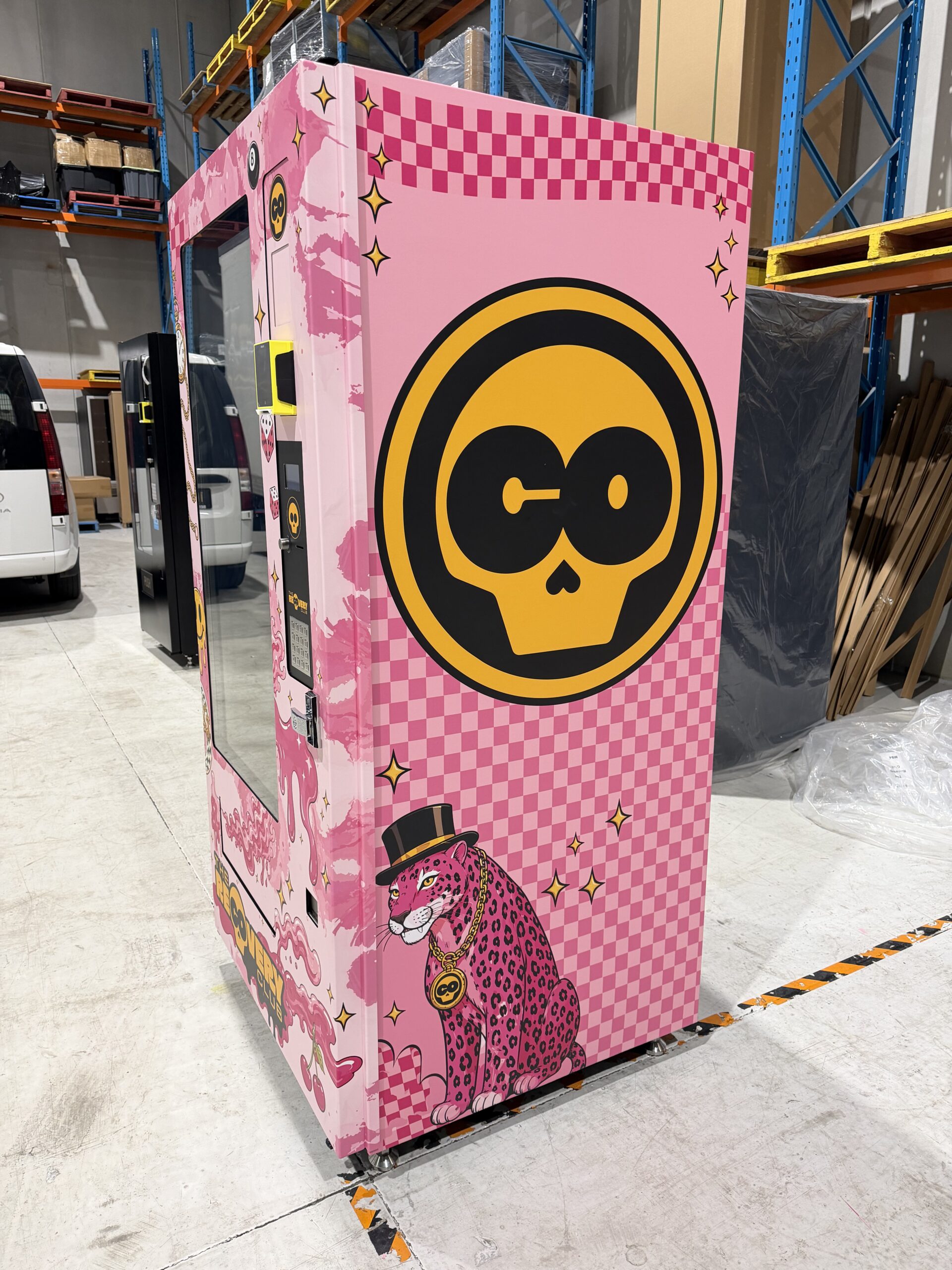
Some projects are about making a machine blend into its surroundings. This one was the opposite. When The Recovery Club came to us, the brief was simple: make it impossible to walk past without noticing. Here's how the wrap came together, from first sketch to final install.
The Brief
The Recovery Club wanted a machine that felt like an extension of their brand personality: playful, bold, and a little bit cheeky. Rather than a subtle logo placement, they were after a full character-driven design that could stand on its own as a piece of visual branding, something people would stop and photograph.
The Design
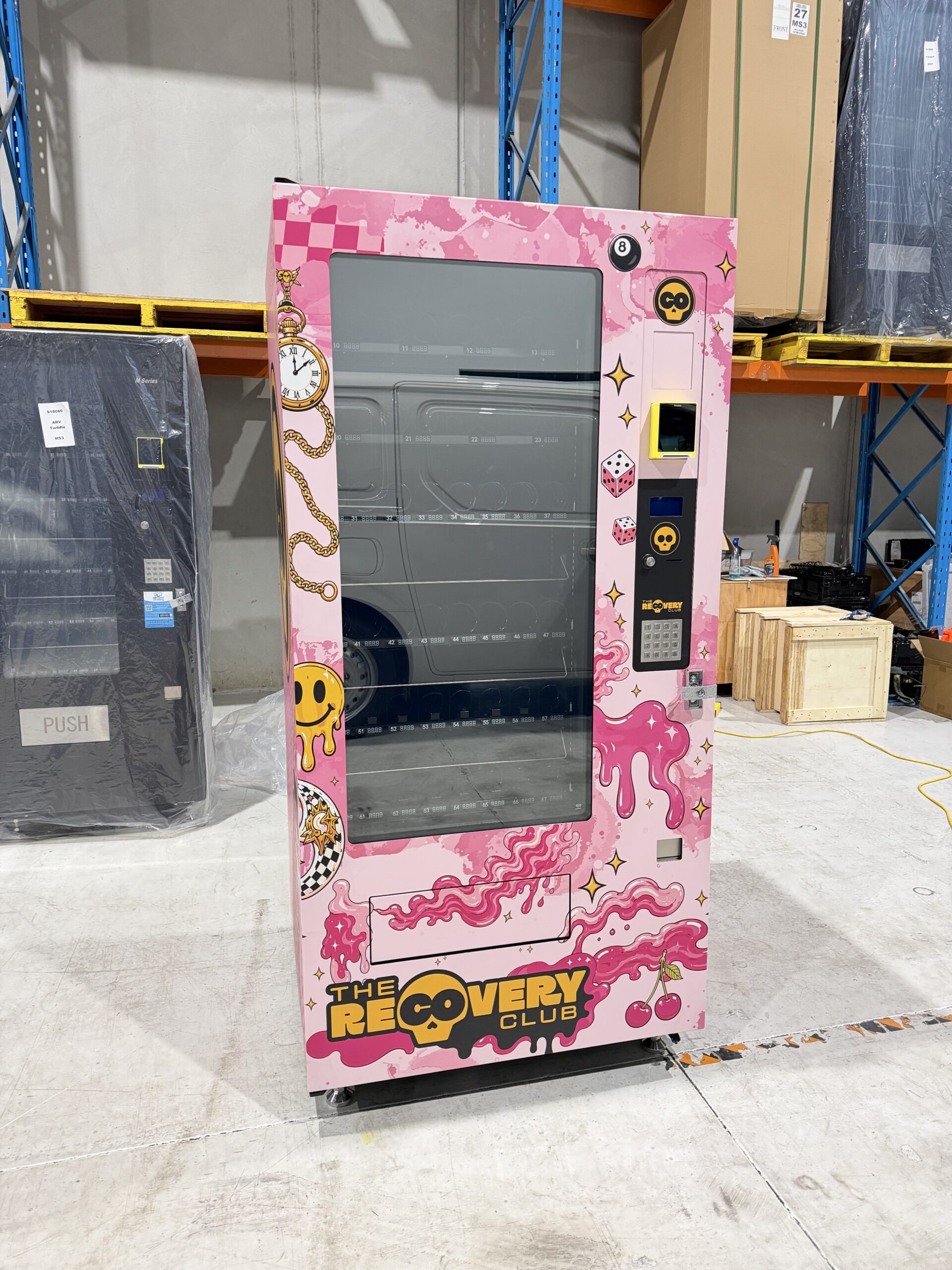
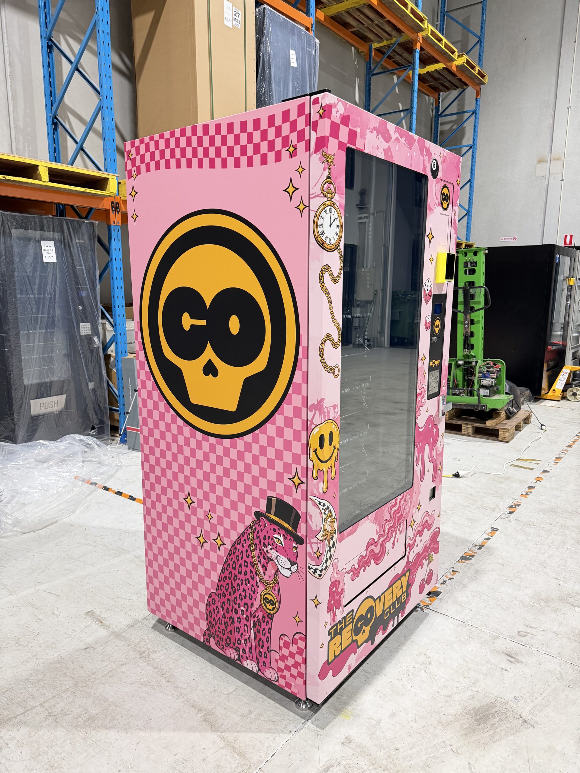
We built the wrap around a hot pink base with a distinctive skull-and-crossbones-style mascot, layered with playful details like drips, sparkles, and dice motifs. Every panel of the machine was treated as part of one continuous design rather than isolated stickers, so the branding reads clearly whether you're seeing it head-on or walking past at an angle.
The Install
Once the design was approved and printed, our team headed on-site to fit the wrap directly onto the machine. Vinyl installation is where a lot of the finish quality actually gets decided: getting panels aligned perfectly at every seam and edge takes a steady hand and a fair bit of patience, especially around buttons, card readers, and display screens.
The Result
The finished machine doesn't look like a vending machine with a sticker on it. It looks like a piece of the brand itself, dropped into a space. That's the difference a full wrap makes over a basic logo application, and it's exactly the kind of project we love getting our hands on.
Want a wrap like this?
Tell us about your machine and your brand.